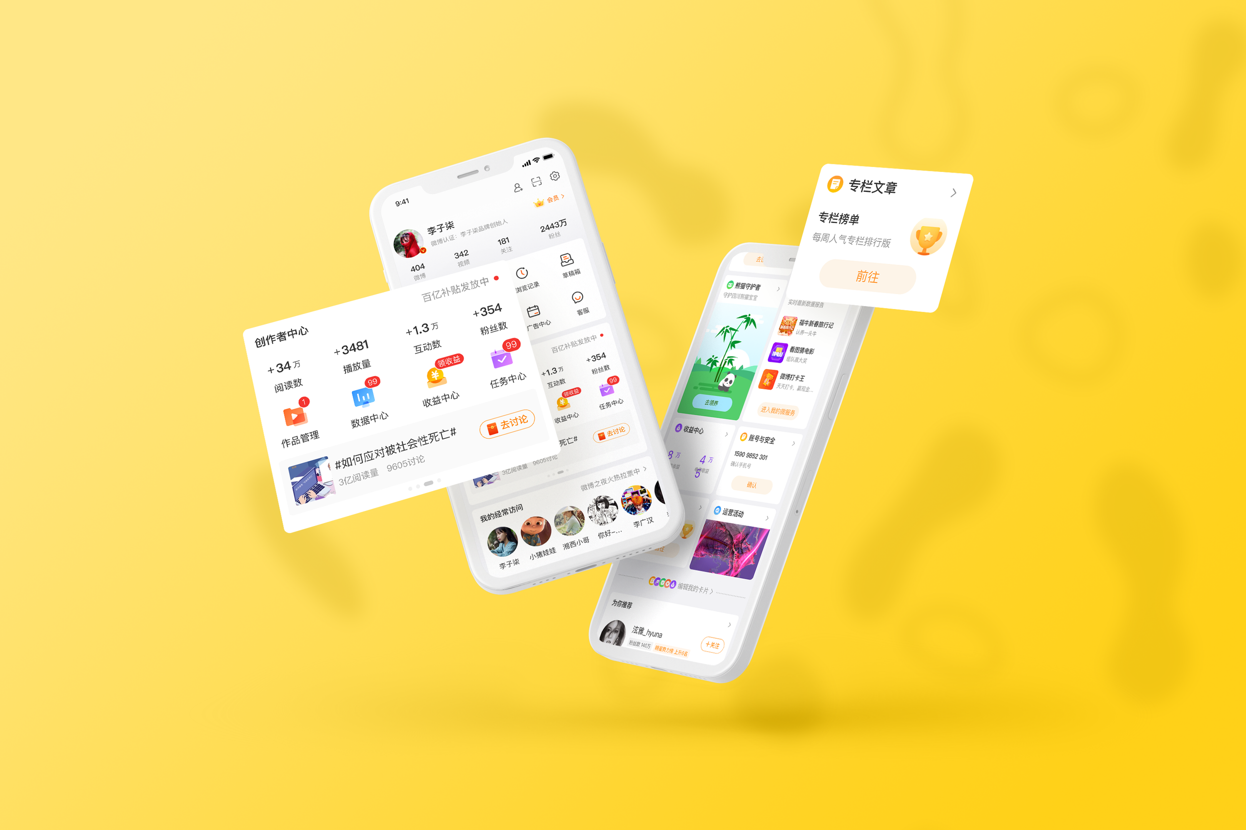
Weibo “Me“ Page Card Optimization
微博“我”页面卡片优化
PERIOD
Nov 2020 to Mar 2021
MY ROLE
U Designer
DESIGN PEERS
Jing Zhang
The "Me" page is the user's main mode management page on Weibo, which provides users with account management, content, relationship maintenance, etc., and the entry of basic product functions.
Weibo user roles are diverse, so the page contains various functions. It is necessary to meet the demands of differentiated groups and improve the overall card browsing efficiency and usage frequency.
微博 ”我“ 页面是用户在微博的主人态管理页面,提供给用户进行账号管理、内容、关系维护等,以及产品基础功能入口。
微博用户角色多样化,因此页面承载功能多样,需要在满足差异化人群诉求,提升整体的卡片浏览效率和使用频率。
Background
项目背景
DEFINE “ME” PAGE 定义“我”页面

On The User Side: My territory
Weibo establishes a "my" concept for users, a kind of "Everything about 'me' can be found here" message.
用户方:我的地盘
微博给用户建立了一个“我的”概念,一种 “所有关于「我的」内容都能在这找到” 的传达。

On Business Side: Facade of the signboard
The "Me" page is the leading traffic scenario of each business, and it is a crucial signboard and facade of the business when users revisit.
业务方:招牌门面
“我”页面是各业务主要流量场景,是用户复访业务重要招牌和门面。
CURRENT SITUATION AND PROBLEM 现状及问题
① There is no targeted distinction between diverse user roles.
无针对性区分多样化的用户角色
③ The click guidance is weak, and operation efficiency is low.
点击引导弱,操作效率低
② As the business volume gradually increases, the original style display efficiency is low.
随业务量逐渐增多,原来的样式展示效率低
④ Cards are monotonous and lack visual appeal.
卡片样式单一,缺少视觉吸引力

The early version of “Me“ page.
Design Goal
设计目标
On the User Side:
Meet the needs of different groups of people, fast positioning, and convenient use.
用户方:满足差异人群需求,快速定位便捷使用
On Business Side:
Improve the overall business exposure and promote user revisit conversion
业务方:提升整体业务曝光,促进用户复访转化
Design Process
设计过程
Prioritize Essential function sections 优先排序重点功能和业务区块
The "Me" page is a very core page of Weibo. It carries a lot of essential content information. Therefore, we first re-divided and sorted the vital functions and business blocks of the "Me" page before in-depth design. Great frame orientation.
The header is the "basic function entrance," which carries the core and general business content, mainly to meet users' daily use, and the bottom is "other businesses"
Different businesses also have their various roles, the most special of which is the "user role business" with "microblogging characteristics," that is, to other functions according to different user roles (ordinary users / Internet celebrities). The remaining services are divided into "high-frequency services," “standard services," “and "low-frequency services" according to the user’s visit and frequency of use.
“我”页面是微博非常核心的一个页面,承载的内容信息非常多也十分重要。因此在深入的设计之前,我们先将“我”页面的重点功能和业务区块重新做了划分和排序,一方面便于我们明确每个区块的设计重点,另一方面也指导后续设计不偏离大的框架方向。
“我”页面头部为“基础功能入口”,承载核心通用的业务内容,主要为满足用户日常使用,下方是其他“各业务方入口”。
不同的业务也有各自不同的角色,其中最特别的是“用户角色业务”,带有“微博特色”,即针对不同用户角色(普通用户/大V)有侧重得进行功能区分。而剩余的业务则根据用户复访和使用频率的不同,按照优先级划分为“重点高频次业务”“普通业务”和“低频次业务”。
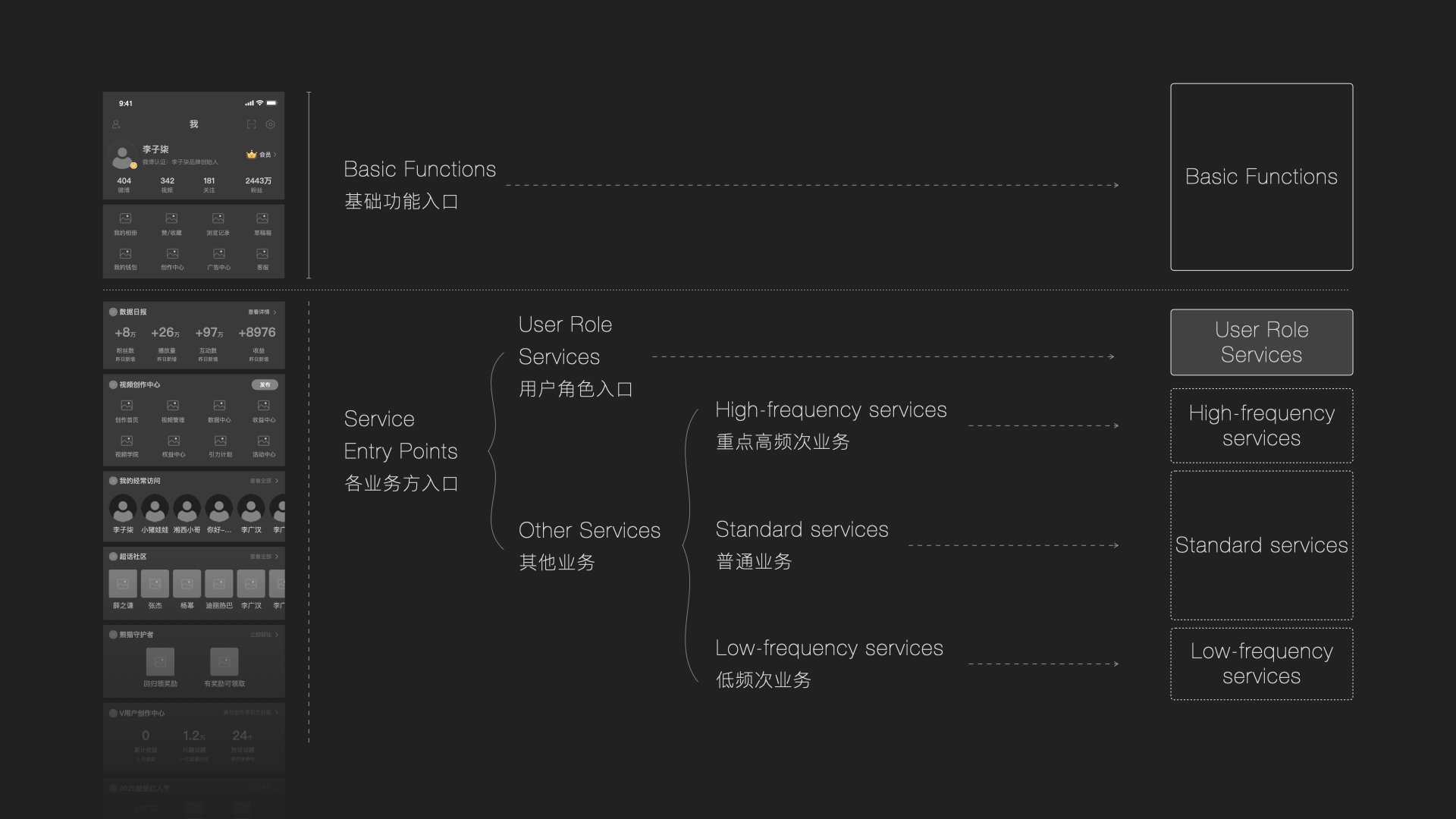

Basic Functions 基础功能
The average number of visitors to the "Me" page is 33.15 million. Details are as follows:
Weibo (6.48 million), settings (6.26 million), followers (6.17 million), avatar nicknames (2.3 million), likes/favorites (2.05 million), followers (1.79 million), and my wallet (1.3 million). Over a million.
The essential functions of the head are the functions of the core. Therefore, we did not make too many changes to the structure of this part, mainly to remove some useless information, gather some commonly used operation entries, and divide "data" and "operation entry" visually.
“我”页面日均访问人数为 3,315 万,详情如下:
微博(648万)、设置(626万)、关注(617万)、头像昵称(230万)、赞/收藏(205万)、粉丝(179万)、我的钱包(130万)使用人数均在百万以上。
显然,头部基础功能都是用户核心刚需的功能。所以我们并没有在重构时,对这个部分的架构做太大改动,主要是去除一些重复的信息,集合了一些常用的操作入口,并且通过视觉的形式划分了”数据“和”操作入口“两个区块。

User Role Services 用户角色业务
The priority of "user role services" is second only to "basic functions," which are specially set for different user types and are an essential part of the different roles of users.
Professional users (content production)
For professional users, adding functions based on content creation and income, and integrating functions such as incentives, guidance, data, and pay, will allow bloggers to manage better and operate their accounts.
Regular users (content consumption)
For regular users, this block should focus on basic functions. Also, increase the entries of often-used services, which is convenient for users to revisit quickly and helps the platform increase user activity and click conversion.
优先级仅次与"基础功能”,针对不同用户类型特别设置,是区分用户不同角色的重要组成部分。
专业用户(内容生产)
对专业用户来说,增加基于内容创作和收益相关的功能,并将激励、引导、数据、收益等功能集为一体,能让博主更好的管理和经营自己的账号。
普通用户(内容消费)
而对于普通用户来说,这个区块应该以基础功能为主,同时增加用户常用功能入口,方便用户快捷复访的同时,也帮助平台提升用户活跃和点击转化。

Redesign Workflow
再设计工作流程

01 List All Involved Tasks
列出所有涉及的任务
So we changed our direction and get rid of the scenario but list all involved tasks together as the first step of redesigning the whole workflow.
所以我们改变了方向,摆脱了场景,而是将所有涉及的任务一起列出来作为重新设计整个工作流程的第一步。

02 Clear The Main Flow
摸清主线流程
We ignored some low-priority tasks, picked out the essential actions in all the functions, and finally listed the main flow.
我们忽略了一些低优先级的任务,在所有功能中挑出必要的操作,最后列出了主要流程。

03 Highlight All Touchpoints
突出所有关键触点
After we list out the main flow, we highlighted the touchpoints to see any duplicated or redundant steps.
在列出主要流程后,我们突出显示了关键触点,以查看是否有任何重复或冗余的步骤。

04 Summarize Workflow
总结工作流程
Finally, we lock down the main workflow and summarize all the paper mockup information into the computer.
最后,我们锁定主要工作流程,然后将所有纸样模型信息汇总到计算机中。

05 Draft Mockup
草稿模型
Then we started to draft the mockup simply with paper and pencil. It’s easy to do and costs almost nothing. It is also an efficient way to discuss all the complex problems that we overlooked.
然后我们开始简单地用纸和铅笔起草模型。 这很容易做到,而且几乎不需要任何费用。 这也是讨论我们忽略的所有复杂问题的有效方式。

06 Lo-fi & Hi-fi Prototypes
低保真和高保真原型
For Custom Voice, the Lo-fi and Hi-fi connect closely. We started from the lo-fi based on our previous pencil sketch, and on the other hand, we also started creating the visual. Hopefully, we can lock down the lo-fi prototype and the visual style at the same time.
对于Custom Voice,Lo-fi 和 Hi-fi 紧密相连。 我们根据之前的铅笔素描从 lo-fi 开始,另一方面,我们也开始创建视觉效果。 希望我们可以同时锁定低保真原型和视觉风格。
Quick Lo-fi Prototype Iteration
快速低保真原型迭代
An efficient design tool can help a lot in this part. We used Balsamiq as the lo-fi creator, then import images into InVision to do the prototype. The cost is meager so that the iteration could be straightforward and fast, so we could learn quickly and leap forward. Also, it’s very convenient for us to communicate with PM, devs, and two test users that we invited. After several versions of the lo-fi test and iteration, we finally lock down the lo-fi mockup.
一个高效的设计工具可以在这部分提供很多帮助。 我们使用 Balsamiq 作为 lo-fi 创建者,然后将图像导入 InVision 来做原型。 成本微薄,因此迭代可以直接快速,因此我们可以快速学习并实现飞跃。 此外,我们与 PM、开发人员和我们邀请的两个测试用户交流非常方便。 经过几个版本的低保真测试和迭代,我们终于锁定了低保真模型。

Hi-fi
高保真
We started thinking about the visual style while designing the first version of lo-fi, came up with several proposals, then decided on the visual direction. After we locked down the lo-fi mockup, we started to conclude the most-used components in the mockup and then created the pattern library first in Sketch to faster the hi-fi process.
After the first version of the hi-fi design, we instantly created the new prototype and delivered it to our internal team to see the reaction. Well, we sure got a lot of helpful feedback from our colleagues. So then, we shifted the second design to the test users. And based on all the feedback, we did several other iterations on the visual design and finally lockdown.
我们在设计 lo-fi 的第一个版本时就开始考虑视觉风格,提出了几个建议,然后决定了视觉方向。 在我们锁定 lo-fi 模型后,我们开始总结模型中最常用的组件,然后首先在 Sketch 中创建模式库以加快 hi-fi 过程。
在 Hi-Fi 设计的第一个版本之后,我们立即创建了新原型并将其交付给我们的内部团队以查看反应。 嗯,我们确实从同事那里得到了很多有用的反馈。 因此,我们将第二个设计转移给了测试用户。 根据所有反馈,我们对视觉设计进行了几次其他迭代,最终锁定。


Learning
经验总结
Focus on the main task 专注于主要任务
After understanding the scenario, we started to think about how to improve flow in each design. Soon, we found it doesn't work well because it's easy to get distracted by many branch flows. For example, when we think about the flow in the "Uploading scenario," we are stuck a long time bulking multiple files and indicating to users if they upload the wrong file type. Indeed, they are the case we should consider, but it's too early to think about all matters at an early stage.
So we change our direction and get rid of the scenario but list all tasks together. Then we can list the main functions and rearrange everything, get rid of the duplicated.
在了解了场景之后,我们开始思考如何在每个设计中改进流程。 很快,我们发现它不能很好地工作,因为它很容易被许多分支流分心。 例如,当我们考虑“上传场景”中的流程时,我们被困了很长时间批量处理多个文件并向用户指示他们是否上传了错误的文件类型。 的确,它们是我们应该考虑的情况,但是在早期阶段考虑所有问题还为时过早。
因此,我们改变了方向并摆脱了场景,但将所有任务一起列出。 然后我们可以列出主要功能并重新排列所有内容,摆脱重复。

Prototype faster, feedback faster, design better
原型更快,反馈更快,更好的设计
Our first mockup started from the “paper and pen sketch,” The first time we presented our prototype to our colleagues was the first version of the lo-fi design. The flow still needs to be polished, and the mockup looks very rough. But we can’t just sit there and guess about the result. We want to build the habit of testing, give to other people as soon as possible, and get feedback faster to lead us to the next design step.
Another benefit about prototyping faster is that we can spot problems quickly and fix them. The earlier you find the problem, the easier it is to change it. Accurate pixels are not easy to get. Imagine if we wait until the hi-fi mockup came up then give it to the actual customers, it will be tough to change anything by that time.
我们的第一个模型从“纸笔草图”开始,我们第一次向同事展示我们的原型是低保真设计的第一个版本。 流程还需要打磨,样机看起来很粗糙。 但我们不能只是坐在那里猜测结果。 我们希望养成测试的习惯,尽快提供给其他人,并更快地获得反馈以引导我们进入下一个设计步骤。
更快地进行原型设计的另一个好处是我们可以快速发现问题并修复它们。 越早发现问题,就越容易改变。 准确的像素不容易获得。 想象一下,如果我们等到高保真模型出现后再将其提供给实际客户,到那时将很难改变任何东西。
